BID Website Design UK: What a Business Association Site Must Do
A proof-led guide to BID and business association website design, using the Kings Heath Business Association build to show what a useful public hub must make easier.
Co-founder of Ampliflow. Builds AI automation, websites, SEO/AEO, and growth systems for UK SMEs.
Measured on the live website
The public experience is fast on phone and desktop.
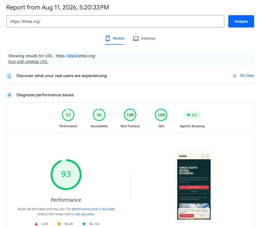
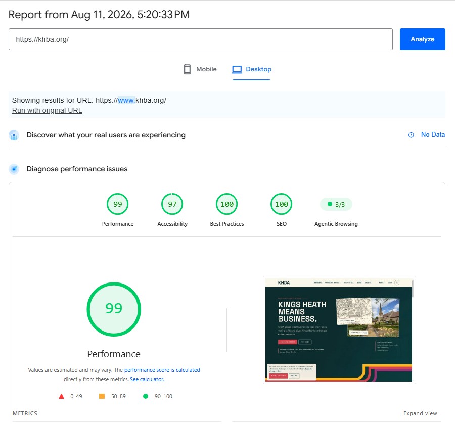
PageSpeed Insights recorded 93 for mobile performance and 99 for desktop performance on khba.org on 11 August 2026. Lighthouse results are lab measurements and can vary between runs.
A good BID or business association website helps members see what their organisation does, visitors discover the area and staff keep practical information current. The Kings Heath Business Association build shows how directories, events and participation can work together.
Here, BID means Business Improvement District, not bidding for a website contract. Kings Heath Business Association is the association project used in this guide; it is not being presented as a statutory BID. The organisations can share website needs while having different governance and reporting requirements.
Most association websites begin with a reasonable brief: explain who we are, list the members, publish the next event and give people a way to get in touch.
Then the year gets busy.
Members change. Events move. Offers expire. A new campaign needs a landing page. A committee member asks whether the website can show what has been delivered. Someone adds another PDF because changing the page feels harder than attaching a document.
The site slowly becomes a noticeboard with a domain name.
That is the real problem a BID website design project has to solve. The visual layer matters, but the more important question is whether the website makes the organisation’s work easier to understand and easier to keep alive.
Published 2 August 2026 · Based on the public Kings Heath Business Association case study
What does a BID website need to do?
A BID or business association website should give members, visitors, partners and the delivery team a clear route to the information that matters to each of them. In practice, that usually means a searchable member directory, useful place and event information, visible campaigns, clear joining or enquiry routes, and an editing system the organisation can operate without waiting for a developer.
The exact mix changes from one organisation to another. The principle does not: the website should show the value of the work and reduce the effort required to participate in it.
That is why BID and business association website design should begin with journeys and responsibilities, not a template gallery.
The case study: one site, several audiences
Kings Heath Business Association represents independent traders and helps promote activity in Kings Heath. Its website needed to serve members, residents, visitors, partners and the association team at the same time.
That is a deceptively difficult brief. These audiences do not arrive with the same question:
- a member may want to update a profile or understand the value of being involved;
- a visitor may want to find a business, an event or Farmers’ Market information;
- a resident may want to know what is happening locally;
- a partner may need a clear explanation of the association’s work;
- the team needs to update the information without turning every small change into a development request.
The public KHBA case study describes the result as a digital home for the network: member discovery, events, Farmers’ Market information, campaigns and joining brought together in one place.
That phrase — one place — is the useful part. It does not mean every piece of information belongs on one long page. It means the information architecture should make the next step obvious.
Walk through the proof before writing the brief
A portfolio can demonstrate delivered pages. A useful commissioning review also asks what someone can do with them, who keeps them accurate and what evidence is still missing. Use the KHBA example to make those distinctions concrete.
Download the website evidence review (CSV). This original Ampliflow worksheet, version 23 September 2026, contains eight review prompts and blank evidence, result, owner and date fields. It is a reusable brief, not a completed test report or an accessibility certification.
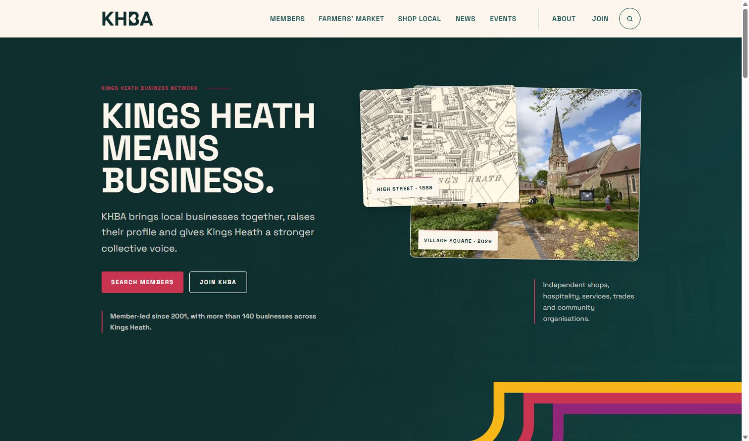
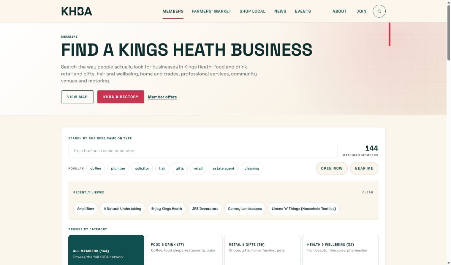
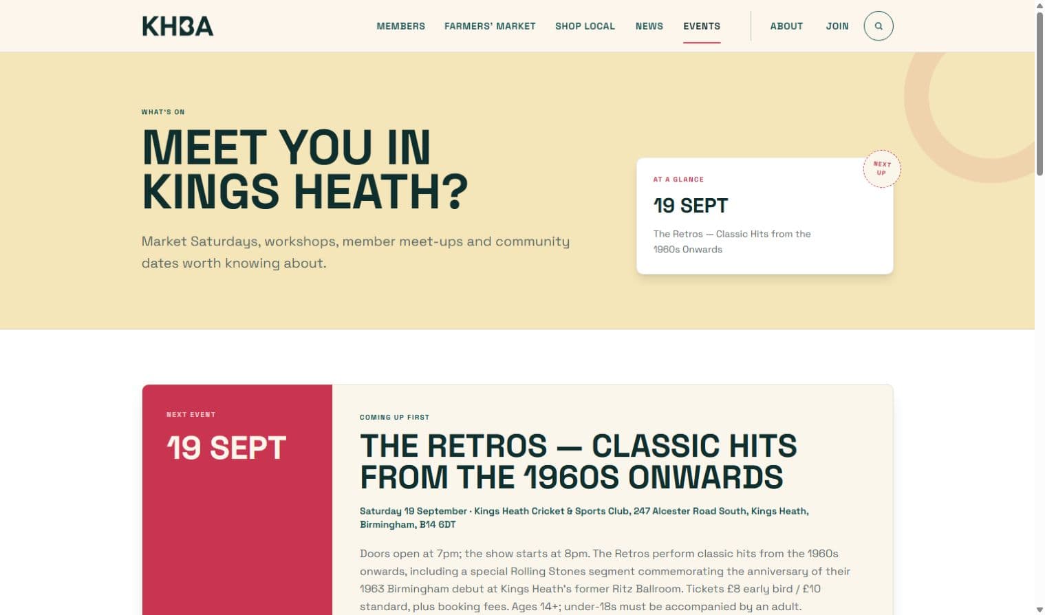
Start with the public KHBA website and the published delivery case study. The directory and event images in this guide show the relevant interfaces; they are evidence of the delivered design, not proof of today's information accuracy.
| Journey | What to inspect | What requires separate evidence |
|---|---|---|
| Find a local business | Directory categories, search and the detail available on a member profile | Accuracy across all members and whether enquiries increased |
| Decide whether to attend | Event date, place and participation information | Attendance, registration completion and ongoing update ownership |
| Correct a member profile | Whether the update route is discoverable and understandable | Receipt, assignment and resolution of a submitted correction |
| Keep information current | The editing responsibilities described in the case study | A permissioned demonstration of an editor changing and restoring a test record |
For example, finding the member-update form establishes that a route exists. It does not establish that a request reaches the right person. An agreed test with a clearly labelled synthetic request can check receipt and ownership; do not submit unsolicited test enquiries to someone else's live site.
Turn the observation into a requirement
“We need a directory like that” is difficult to accept or reject at handover. “A visitor can find a relevant member, understand what it does and reach the correct contact route” gives the team a journey to demonstrate. Add who approves changes, what happens when a member leaves and how an incorrect listing is reported.
The same discipline applies to evidence of performance. The PageSpeed screenshots in this guide are dated lab observations. They do not establish all-device accessibility, member satisfaction, search growth or additional revenue. If those outcomes matter to the brief, agree how each will be measured separately.
For a wider supplier review, the Next.js agency guide explains how to carry the evidence through to ownership and launch checks. Choosing a framework comes after agreeing the journeys.
1. A member directory should be a route, not a list
Many association directories are technically present but practically weak. They contain names and logos, then ask the visitor to leave the website and search elsewhere for the context that makes a member relevant.
A useful directory answers three questions quickly:
- What does this member do?
- Where can I find or contact them?
- Why might they be relevant to me today?
For KHBA, the public case study describes a searchable home for independent businesses, member profiles and local offers. That is more useful than a static roll of logos because it gives the directory a job: help people discover and choose local businesses.
The design detail is less important than the operating detail. Someone must own profile accuracy. Members need a simple way to request an update. The team needs to know what is published and what still needs checking. If the directory cannot stay current, its search box becomes a promise the organisation cannot keep.
When reviewing a website or member platform in the wider work, ask to see the editing and approval route as well as the public page. The visible experience and the operating experience are one system.
2. Events need context, not just dates
An event page that says “Saturday, 10am” is a calendar entry. It is not yet a reason to attend.
People need the practical context around an event: who it is for, what they can expect, where it takes place, how to take part and what else is happening nearby. A BID may also need to connect an event to member businesses, a campaign or a wider place-marketing story.
The KHBA case study calls out Farmers’ Market information and events as first-class parts of the website. That is a useful model. The event is not buried in news, and the market is not treated as a one-off announcement. Both become discoverable routes through the place.
This also gives the team a clearer publishing rhythm. A market date, a trader profile and a local campaign can support one another instead of being three disconnected updates spread across the website, email and social feeds.
3. Joining and participation should be designed as journeys
“Join us” is not a journey. It is a label.
The journey starts earlier, when a potential member asks what the organisation does, who it helps and whether the relationship is worth exploring. It continues through the information they need to provide, the questions they have before joining and the confirmation they receive afterwards.
The public KHBA work includes join routes and member profile-update routes. That matters because participation has two sides: the organisation needs new involvement, and existing members need a low-friction way to keep their presence accurate.
For a BID website, the equivalent may include levy-payer information, project updates, consultations, feedback, event participation or a route to report a change. The labels will vary; the design question is the same:
Can someone understand the next useful action without already knowing how the organisation works?
If the answer is no, adding another paragraph will not fix it. The route needs to be visible, specific and owned.
4. Campaigns and news should explain movement
An association website often has a “news” section that becomes a storage cupboard. Each item is published once, then disappears below the fold.
Campaigns need a different structure. They should explain what is changing, why it matters, who is involved and what the reader can do. A campaign page can link to member businesses, events, consultation routes and supporting evidence. It becomes a place the organisation can keep returning to, rather than a post that expires as soon as it is published.
The KHBA build includes space for local updates, association activity and reasons to support Kings Heath. That is a small but important distinction: the site is not only reporting activity; it is helping the place make a case for itself.
This is where content architecture beats content volume. Five clear routes that the team can maintain will outperform fifty updates that nobody can find.
5. The team must be able to update the site
The most expensive content system is the one nobody trusts.
If a team is afraid that a routine edit will break the layout, they will delay it. If every change requires a developer, the public site will drift away from the real organisation. If the CMS exposes too much complexity, the answer becomes another spreadsheet or PDF.
The KHBA case study uses Sanity as the editing area and says the team can update most everyday content itself. That is the standard to look for: controlled flexibility, not an intimidating dashboard and not a locked template.
A sensible editing system should make the common tasks obvious:
- update a member profile;
- add or amend an event;
- publish a campaign or local update;
- change a practical detail without redesigning the page;
- keep the information architecture intact while the content moves.
The technical choice matters less than the handover. Who owns the accounts? What can the team edit? What still needs specialist support? How are changes reviewed? A website is not finished when the homepage looks polished. It is finished when the people responsible for its accuracy can use it with confidence.
6. Mobile and search are part of the public service
Members and visitors will not experience the website in a design review. They will open it on a phone while walking through the area, looking for an event, checking a business or trying to understand a campaign.
That makes mobile layout, performance, accessible headings, descriptive links and indexable content basic service requirements. A directory that is awkward to use on a phone is not merely less elegant; it is less useful. An event page hidden behind a script is harder for people and search engines to discover. A beautiful page with no clear title or internal route is difficult for an AI answer engine to understand and cite.
The strongest approach is still ordinary good SEO: write for people, use headings that match real questions, keep key answers self-contained and make the relationship between the organisation, its place and its members clear. Search and AI visibility are consequences of a useful information system, not a substitute for one.
What should you measure after launch?
Do not begin with a dashboard full of numbers. Begin with the decisions the website needs to support.
For a BID or association, a practical measurement set might include:
| Question | Useful signal |
|---|---|
| Are people finding members? | Directory visits, profile views and outbound contact actions |
| Are events discoverable? | Event-page views, direction or registration actions and return visits |
| Do members participate? | Profile-update requests, join enquiries and campaign interactions |
| Can the team keep information current? | Publishing cadence, update ownership and unresolved content requests |
| Can the organisation show its work? | Visits to project, campaign, outcome and reporting pages |
These are measurement categories, not promises of a particular result. Establish the baseline before launch, keep consent and privacy requirements intact, then compare like with like. A low-volume, high-intent action can matter more than a large pageview total.
Connect those actions to the organisation's actual goals. A member joining, an event registration and a profile update answer different questions; report them separately. Our dashboard guide explains how to give each measure a definition and an owner.
Build, improve or leave the current site alone?
Not every association needs a full rebuild. A focused improvement may be enough when the information architecture is sound, the editing system is usable and the main problem is a small number of broken journeys.
A rebuild becomes more sensible when:
- the directory is hard to search or impossible to keep current;
- events and campaigns are scattered across disconnected pages;
- the public site cannot explain member value clearly;
- the team depends on a developer for routine information;
- mobile visitors cannot find the next step;
- reporting and delivery evidence have nowhere useful to live.
Start with the failure that costs the organisation the most attention. Map the member, visitor, partner and team journeys. Keep the parts that work. Replace the parts that make ordinary work harder. That is a more honest brief than “make the website feel modern”.
What the KHBA build proves
The KHBA example does not need a dramatic before-and-after statistic to be useful. Its proof is visible in the shape of the system:
- member discovery has a home;
- events and Farmers’ Market information are discoverable;
- campaigns and local updates have somewhere to live;
- joining and member updates have clear routes;
- the team can update most everyday content itself;
- the public website has a live destination people can visit.
The client feedback on the public case study is equally direct: “We can’t thank Ampliflow enough — very professional and delivery ahead of time.” The quote is not a substitute for a measurement plan. It is a reminder that delivery quality includes the experience of getting the work done.
Questions to ask a BID website agency
Put three editing tasks in the supplier brief
Ask the proposed editor to update a member's opening hours, change an event date and publish a campaign update. Agree what happens when information expires and who approves sensitive changes. A screen recording or supervised demonstration is more useful than a claim that the CMS is easy to use.
| Journey | Acceptance check | Ongoing owner to name |
|---|---|---|
| Find a member | A visitor can find the relevant business and current contact information on a phone | Directory editor |
| Plan a visit | Event dates, place and practical details are clear; past events are distinguishable | Events editor |
| Understand the organisation | Membership, participation and delivery information have clear destinations | Association or BID team |
| Keep the site current | Approved editors can make the agreed changes and recover a mistake | Content owner and technical support |
For a statutory BID, separately scope any business-plan, ballot, levy-payer or governance information required by that organisation. Do not assume the association example covers those requirements. The site's scope should follow the organisation's actual responsibilities.
Before choosing a supplier, ask:
- How will you map member, visitor, partner and team journeys before designing screens?
- Can you show the editing route for a member profile, event and campaign?
- What happens when a member needs to request a change?
- How will the site remain useful on a phone and discoverable in search?
- Which pages will help us show delivery and member value over time?
- What will be measured, who owns it and how will we review the baseline?
- What is the smallest sensible first release if the full rebuild is not yet justified?
Good answers should make the work feel clearer, not more mysterious.
A useful next step
Bring the current website, the questions members ask most often and the updates your team struggles to keep current. We can help you find the first thing worth fixing, whether that is a directory, an event route, the CMS or the whole public hub.
If you want to see the proof first, read the Kings Heath Business Association case study and browse selected work.